Maestro Health Branding
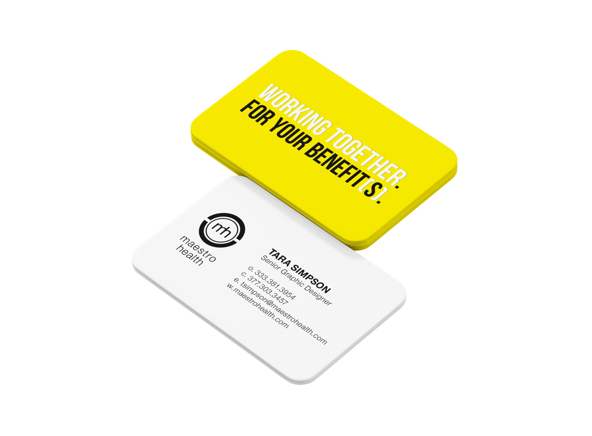
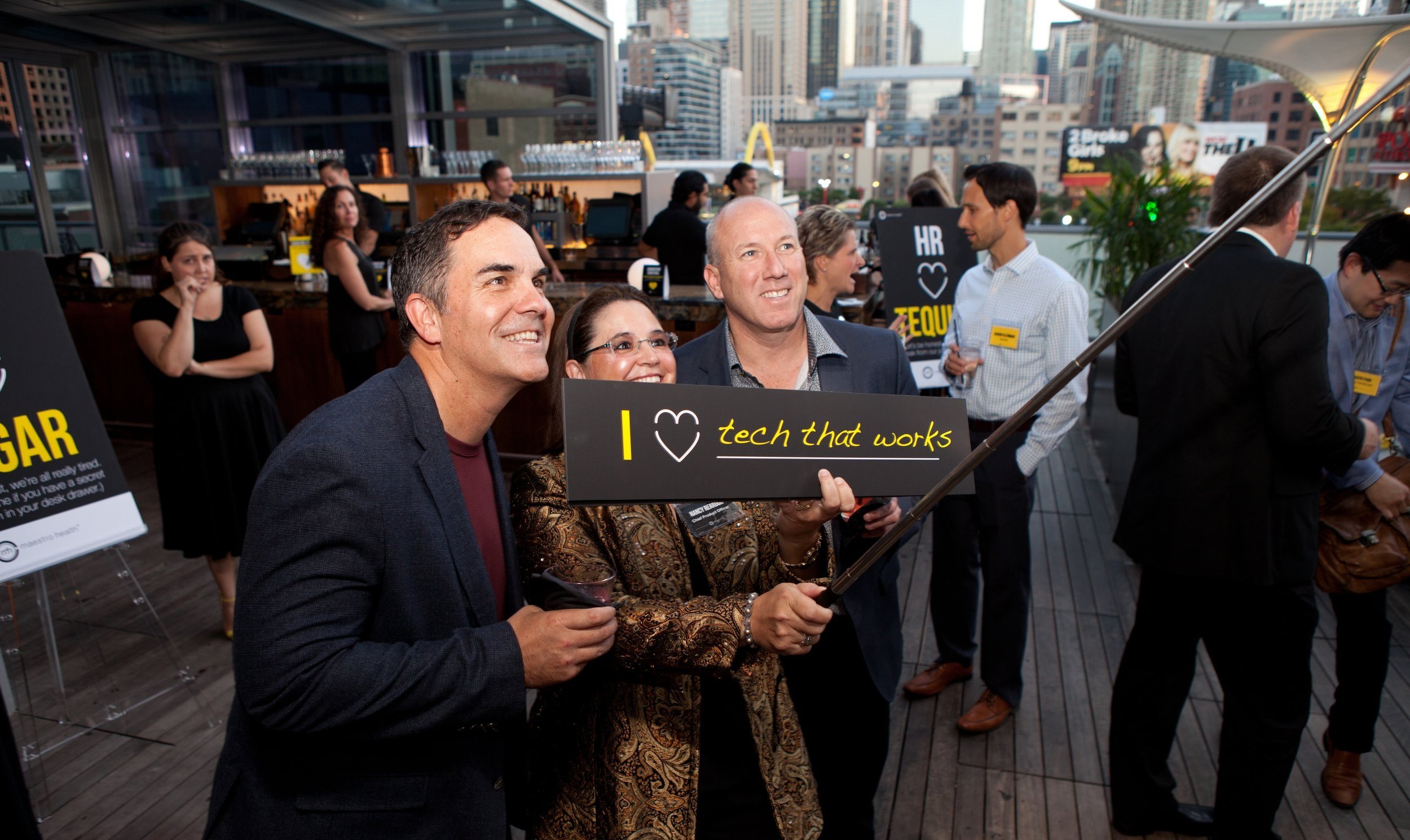
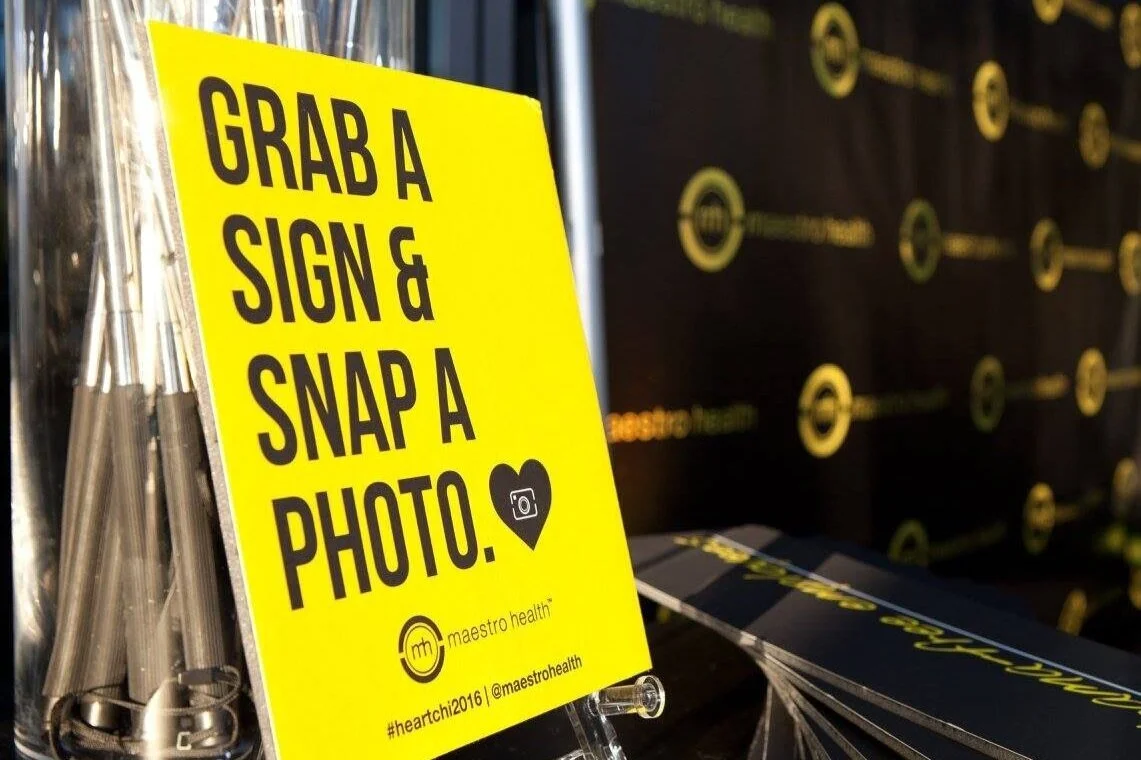
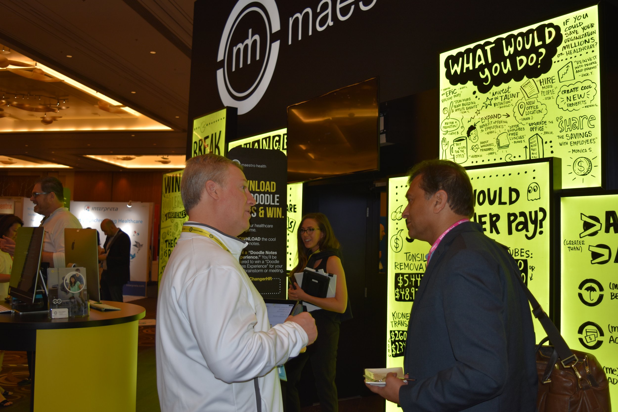
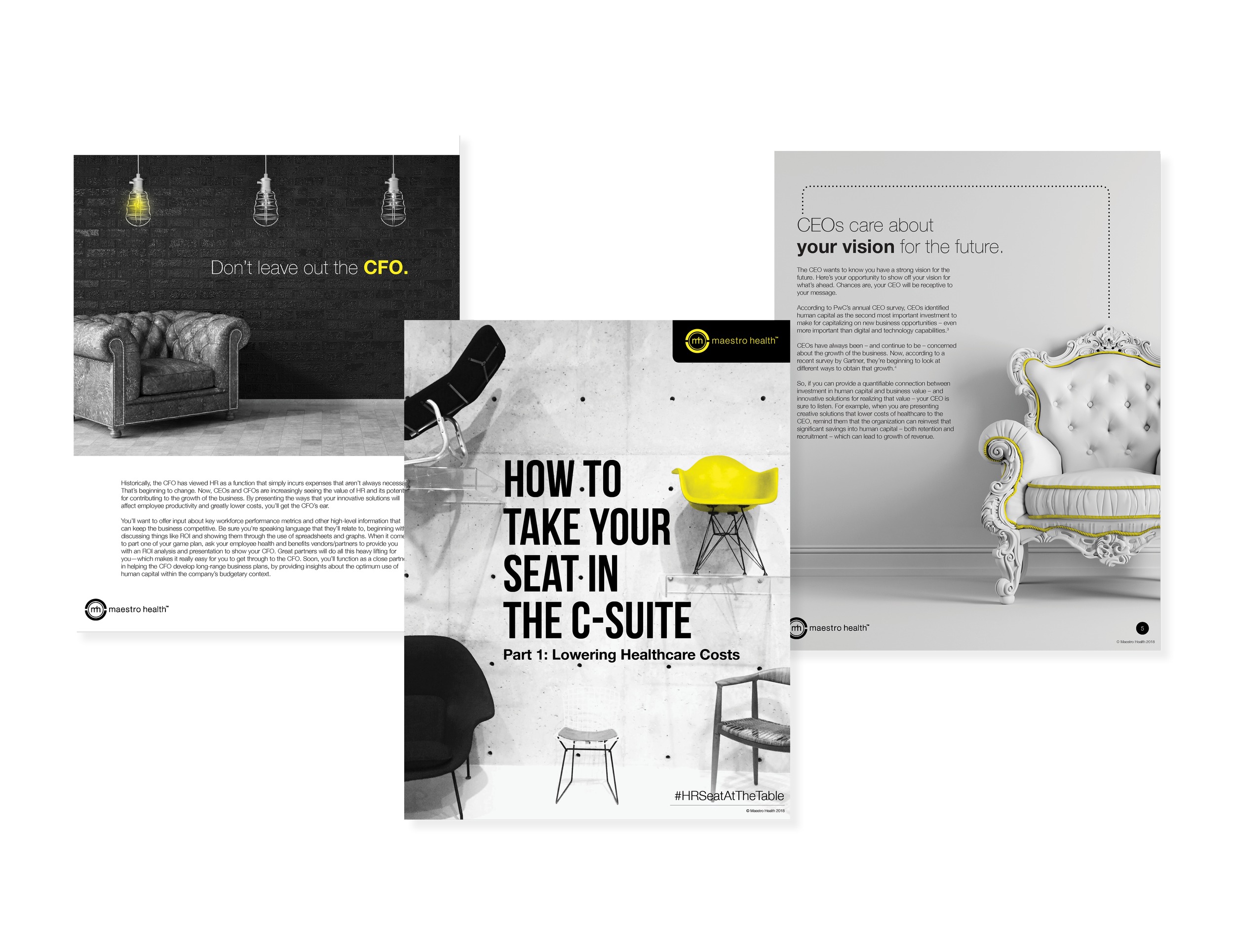
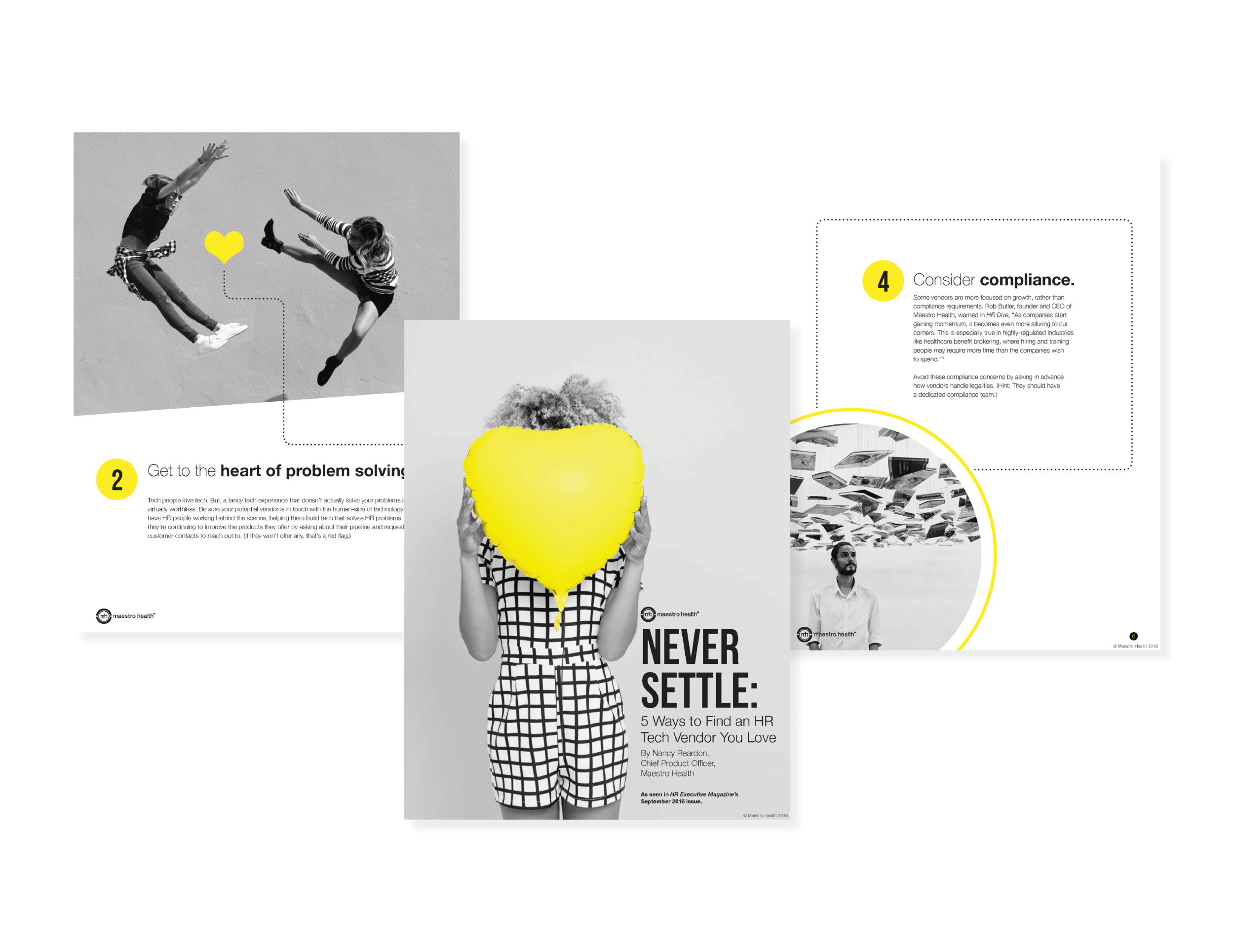
Maestro Health is a healthcare technology company that is on a mission to make employee health & benefits people-friendly again. Working with a small marketing team in 2015, I created the branding for Maestro Health. The logo has two pieces coming together to signify the tech-meets-service pieces joining onto an all-in-one platform (signified by the center circle). Yellow, dark gray and black were chosen as the main swatches of the color palette in order for the brand to stand out in the healthcare space. The icons also have pieces of the logo reflected in them as they also have pieces coming together. As you scroll you will see the brand applied across multiple facets including a tradeshow booth, print collateral, business cards, letterhead, promo items, a trend report, infographics, an advertisement, an invitation, some social posts and some whitepaper page examples. Check out a video application of the brand here.


